- Управленческие отчеты в Excel
- Дашборд в Excel с картой
- Dashboard с динамическими массивами
- Анализ бюджета доходов и расходов (БДР) по месяцам
- Dashboard в Excel с кроссфильтрацией
- Free Excel Dashboard Templates
- KPI Dashboard Template
- Sales Management Dashboard Template
- Project Management Dashboard Template
- Product Metrics Dashboard Template
- Project Portfolio Dashboard Template
- Discover An Easier Way to Create Dashboards with Smartsheet
- Excel Dashboard Templates
- Build stunning Dashboard Templates
- Traffic Light Dashboard Template
- Human Resources KPI Scorecard
- Social Media Dashboard Template
- HR Analytics Dashboard
- Financial Dashboard Template
- Dashboard Best Practices
- Dashboard Example
- Dashboard Form Controls
- Customer Service Dashboard
- Dashboard UX Template
- SEO Analytics Dashboard
- Call Center Performance Template
- Customer Analytics
- Healthcare KPI Dashboard
- Dynamic VBA Dashboard
- Free Dashboard Widgets
- Sales Dashboard
- Product Metrics Dashboard
- Rolling 6 months Dashboard
Управленческие отчеты в Excel
Подготовили подборку разработанных нами интерактивных управленческих отчетов в Excel для экономистов и финансистов. Эти отчеты или дашборды можно скачать, заполнить данные и вносить изменения, а еще разобраться с тем, как они построены и «прокачать» свои навыки в Excel. Но не обещаем, что это будет легко )
Скачивайте файлы — это бесплатно. А если вы хотите научиться строить такие отчеты самостоятельно, приходите к нам на курсы .
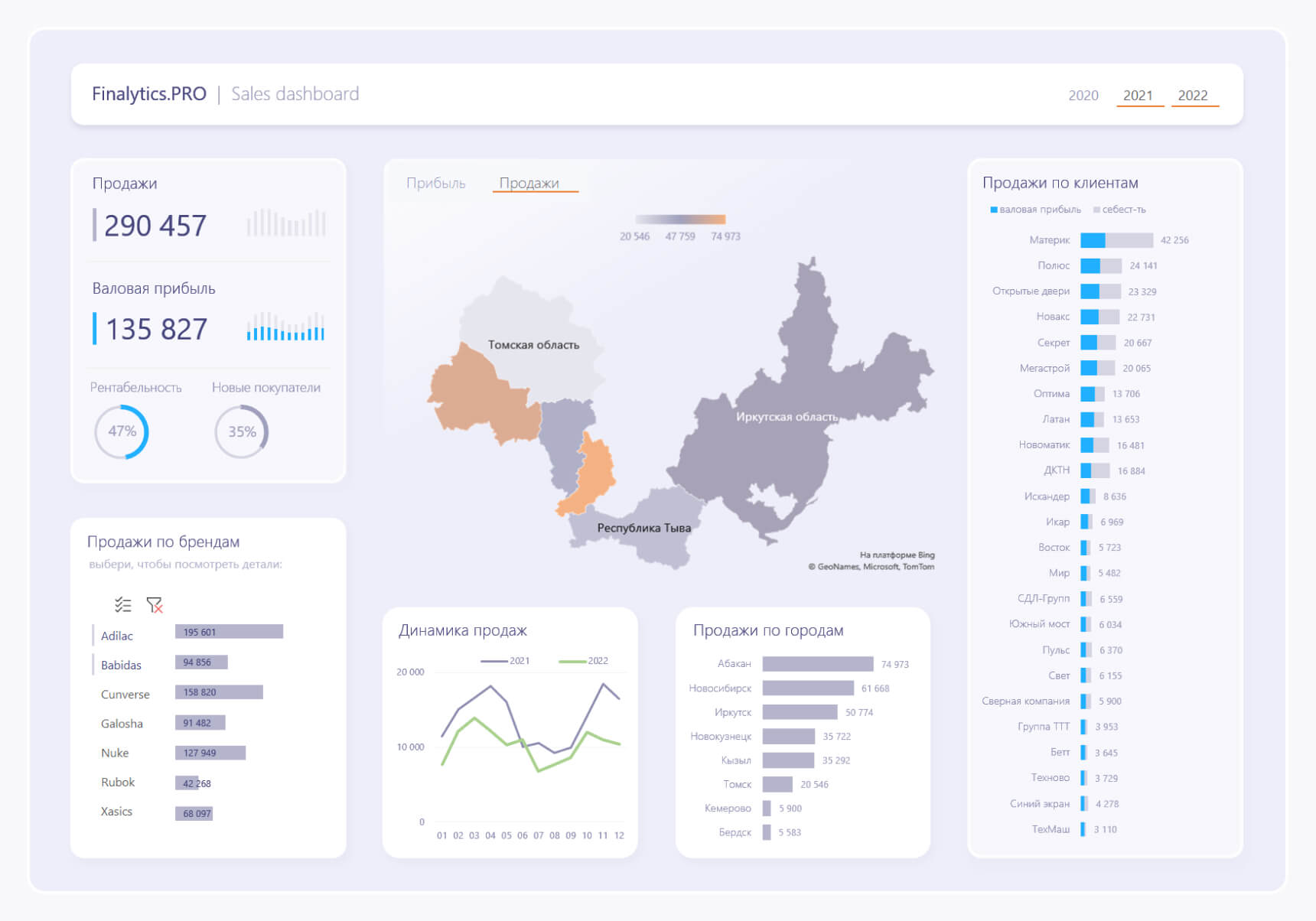
Дашборд в Excel с картой
Dashboard реализован обычными инструментами Excel с интерактивными срезами, которые переключают данные, а также карту и линейчатую диаграмму. Подробнее >>
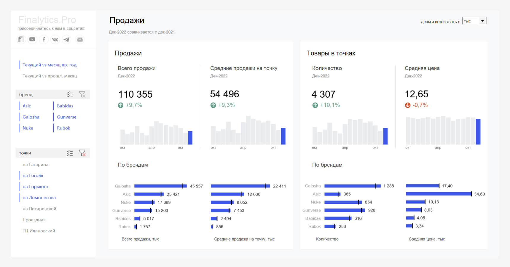
Dashboard с динамическими массивами
Файл создан ради эксперимента, с помощью формул динамических массивов, сводных таблиц и срезов. Подробнее >>
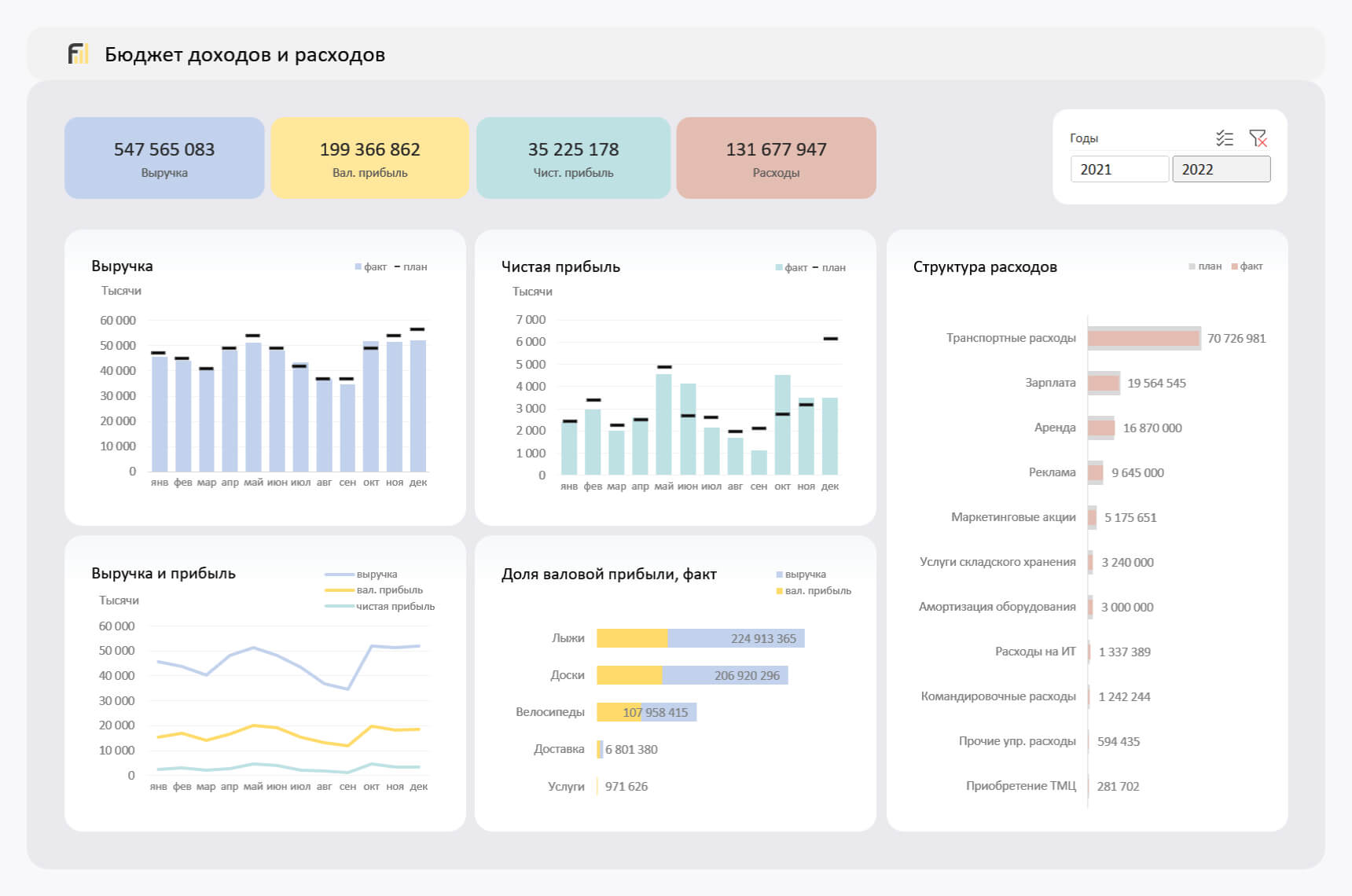
Анализ бюджета доходов и расходов (БДР) по месяцам
Отчет показывает динамику изменения основных показателей БДР по месяцам: прибыль, расходы и выручку, а также позволяет сравнить план и факт. Подробнее >>
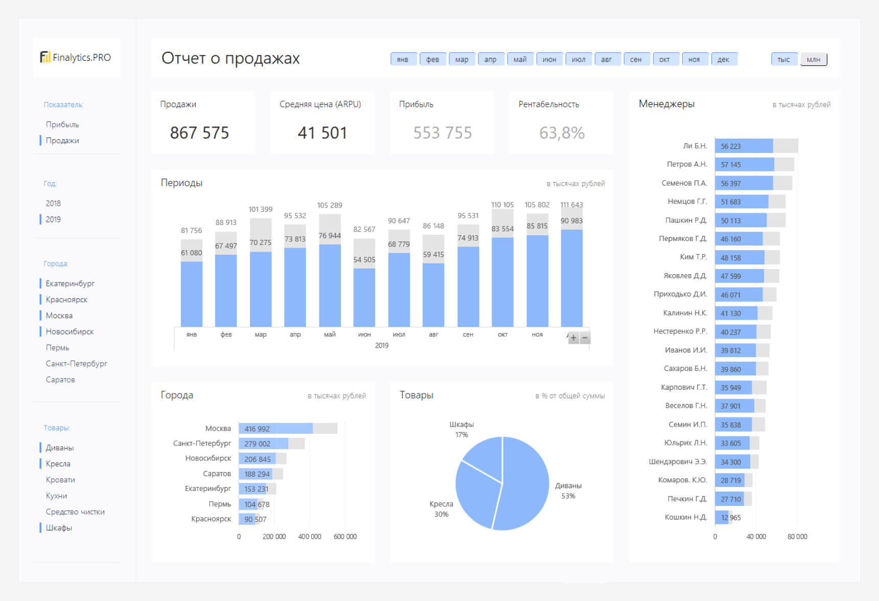
Dashboard в Excel с кроссфильтрацией
Подготовили для вас Dashboard с надстройкой Power Pivot. Он замаскирован под Power BI с кроссфильтрацией, подсветкой элементов, переключением показателей и другими полезными штуками. Подробнее >>
Если вы хотите научиться консолидировать бюджеты с использованием Power Query и выполнять расчеты ключевых показателей с помощью DAX-формул, приходите к нам на курс « Бюджетирование с Business Intelligence ».
Free Excel Dashboard Templates
A dashboard report is a powerful tool for meeting business objectives, displaying vital company data in a one-page layout. Excel dashboards typically include multiple spreadsheets. One is the actual dashboard, the front-facing page which graphically displays information using tables, charts, maps, and gauges (also referred to as speedometers). The other spreadsheets in an Excel dashboard hold the data that is being tracked and the calculations that are being used to analyze that data.
Excel dashboards can look quite different depending on business needs. To get you started with a dashboard, we’ve compiled the top Excel dashboard templates (compatible with earlier versions of Excel, including Excel 2007 and Excel 2010) that you can download for free. We’ll also show you an easier way to make a dashboard with Smartsheet, an online work management tool.
KPI Dashboard Template
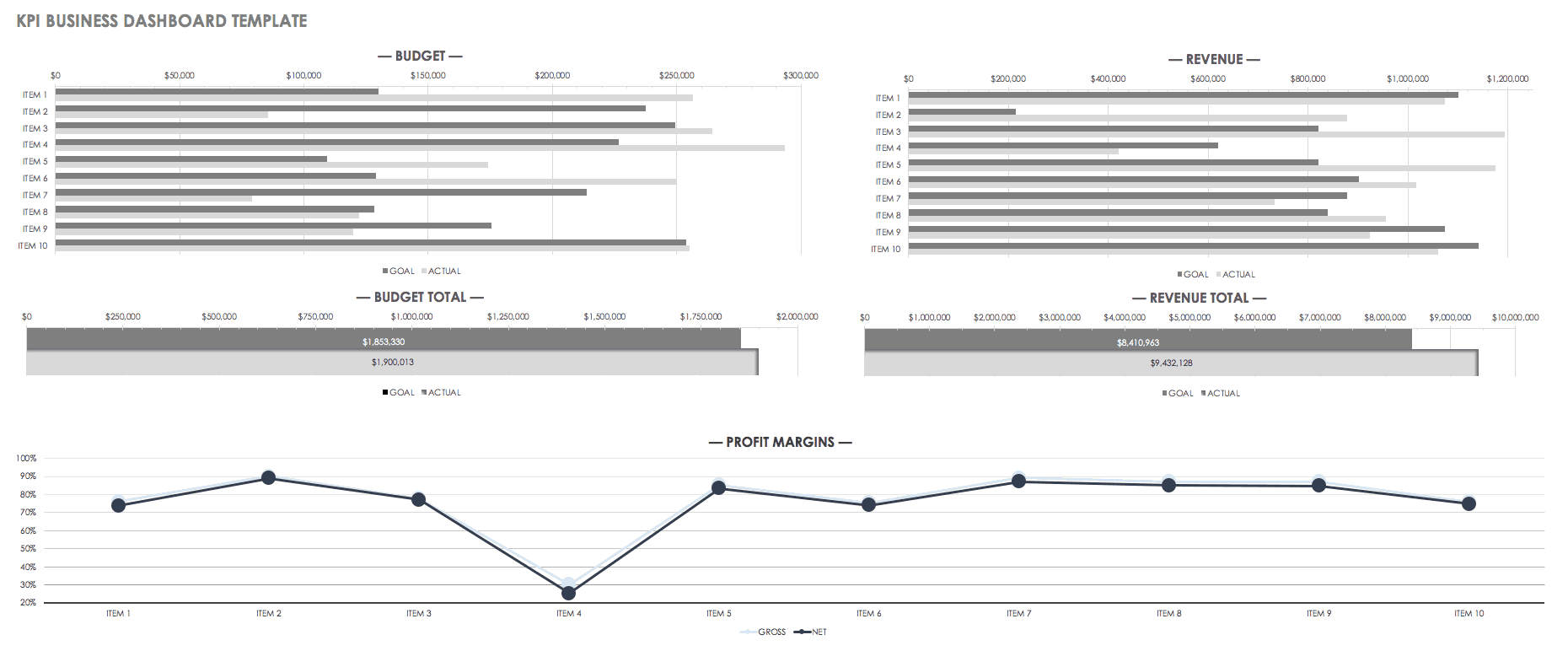
Track key data points using a KPI dashboard to maximize business performance. You’ll save time by not having to produce multiple reports, and the consolidated metrics can easily be shared between teams. This free KPI dashboard template allows you to view multiple KPIs in both table and graph formats. Compare performance between selected KPIs and view averages and targets per KPI. The dashboard design is simple and easy to read.
Sales Management Dashboard Template

Create a visual representation of sales results in order to boost performance, create accountability and track progress. Any process is easier when you can make data-driven decisions, and sales management is no different. This free sales management dashboard template allows you to track sales based on product, region, and customer type.
Project Management Dashboard Template
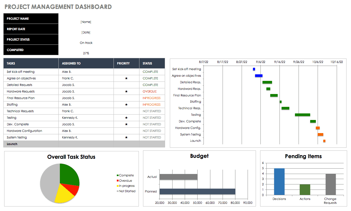
A project management dashboard allows managers to stay on top of multiple aspects of a given project and view them in a single snapshot. Tracking issues, activities and progress becomes much easier when the data can be compiled and viewed as a dashboard. Not only does this help streamline project management, but it makes it easier to provide up-to-date project status reports or share information with team members.
Product Metrics Dashboard Template
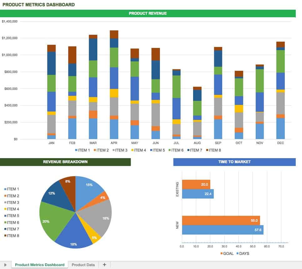
Key metrics provide product information not only to product managers, but also to stakeholders and others within an organization. This data could include metrics related to monetary performance, customer interaction with a product, or other business goals. Once you’ve identified the key metrics and KPIs for your products, you can track them using a product metrics dashboard. This free template offers a simple interface for tracking and visualizing information.
Project Portfolio Dashboard Template
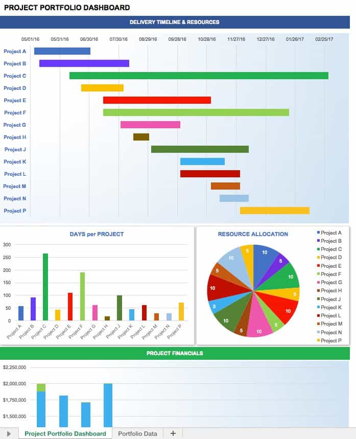
Unlike a project management dashboard, which focuses on data for a single project, a project portfolio dashboard displays KPIs for multiple projects. This provides a status overview for all projects underway, showing which projects are on schedule and what issues need to be addressed. You can easily track budget, risks and other key project parameters. Use this free template as-is to manage your project portfolio, or customize it to meet the needs of your organization.
Discover An Easier Way to Create Dashboards with Smartsheet
Empower your people to go above and beyond with a flexible platform designed to match the needs of your team — and adapt as those needs change.
The Smartsheet platform makes it easy to plan, capture, manage, and report on work from anywhere, helping your team be more effective and get more done. Report on key metrics and get real-time visibility into work as it happens with roll-up reports, dashboards, and automated workflows built to keep your team connected and informed.
When teams have clarity into the work getting done, there’s no telling how much more they can accomplish in the same amount of time. Try Smartsheet for free, today.
Excel Dashboard Templates
We would love to share more of our free Excel dashboard templates! You are right at the right time if you need a fresh idea to create stunning dashboards in Excel. If you want to learn all about dashboards, we recommend diving deep into our examples. Then, download our free spreadsheet templates if the task is simple.
If your task is basic, check our chart templates. On the other hand, if you want to make a stunning report in minutes, we recommend our chart add-in.
What is an Excel Dashboard? A dashboard is a powerful tool for visualizing information. A great-looking dashboard can improve your use and get a sense of your data. Dashboards are great for many tasks, not only to display the achievements of a company. If we have enough data, we can take more efficient steps.
Build stunning Dashboard Templates
In this topic, we will show you the most efficient technics. Starting from the ground up, we will go forward with you! Generally, we’ll use the best techniques and visualization guidelines when building a template.
Follow our step-by-step tutorials, and don’t forget to download the best free excel dashboard templates! All of them are compatible, work fine with Excel 2010 to Microsoft 365 and enable you to use high-level data visualization.
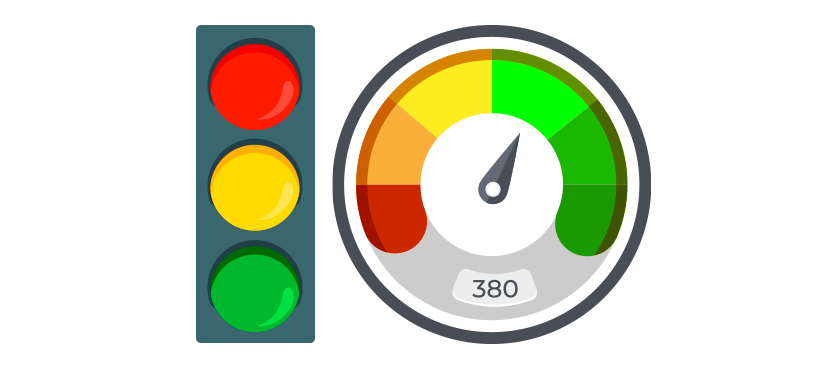
Traffic Light Dashboard Template
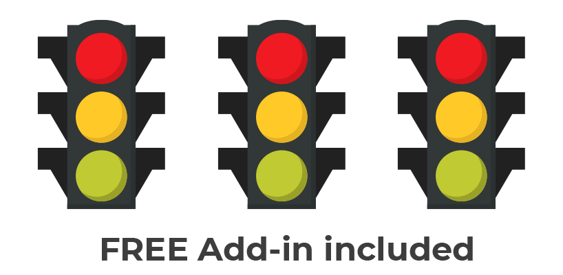
We have good news for the Excel funs! No more traffic jams if you use our traffic light dashboard! Just work or learn using our fully editable and free stoplight template. Before creating a dashboards or templates, set up your goals. It is important to decide what metric is most suitable for you.
In the example, you will learn how to track a project using a smart way. Use key performance indicators, and you can measure all activities easily.
One of the most liked tools is conditional formatting in Microsoft Excel. A traffic light report is an all-round tool, and it is not a difficult task to build it.
As usual, the light has three statuses. Use three different colors (red, yellow, and green) to track the project status!
Before we take a deep dive: just a few words about the solution. We apply a new method besides the VLOOKUP and SUMIF formulas. Learn how to build dashboards from the ground up using a blank Excel workbook.
Human Resources KPI Scorecard
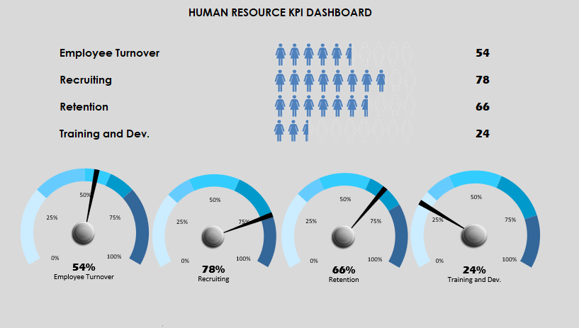
Today’s guide will be about how to create a Human Resources Dashboard Template using typical hr metrics. HR is responsible for recruitment, handling employee records, administer payroll and follow-up work performance. As part of the building of the dashboard, we are focusing on the most frequently used HR KPI measures.
For convenience, we’ve just grouped them under the following four categories: Employee Turnover, Recruiting, Retention, and Training. Using this dashboard, you can easily track your employee human resource data using a single Worksheet. The template is portable and can be deployed in seconds.
We’ll use qualitative and quantitative metrics to provide better dashboards. The published template is an intermediate level spreadsheet. Which is the best way to create a useful and user-friendly dashboard? We will share with you some great data visualization technics like shape-based people graphs and speedometers.
Social Media Dashboard Template
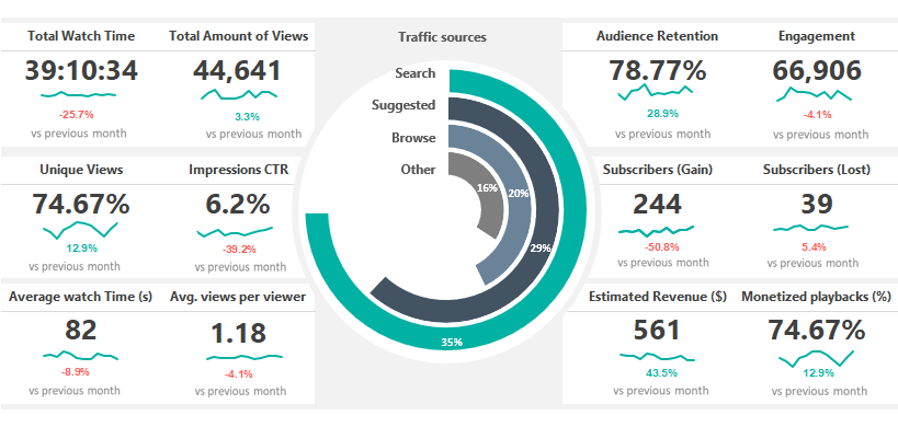
Social Media Dashboard Template is fully optimized for Youtube channel tracking using Microsoft Excel. The free excel dashboard gives you a quick overview and helps you to track views and engagement on your videos. Are people engaging with your video tutorials? Use this spreadsheet to analyze and measure social engagement, and discover trends and know your audience.
Many users need more details to analyze data using an easier way. In the example, you only need to replace your initial data on the ‘data’ sheet. You will able to create various reports for Twitter, Pinterest, or Facebook analytics. It’s important to understand how all of these metrics work. Look at all your data in a single location in Excel. The report enables you to stay on top of social media analytics from all of your favorite social media channels.
The Template uses our latest dashboard framework. You can track the most important metrics like Total watch time, Audience Retention, Engagement, Impressions CTR. Furthermore, you will get information about the revenue if you check the ratio of Estimated revenue and Monetized Playbacks.
Finally, follow the Subscriber’s trend in real-time. Last but not least, analyze the traffic sources on a stunning radial bar chart. Follow our step by step tutorial! Learn more and discover how to build stunning dashboards in a few clicks.
HR Analytics Dashboard
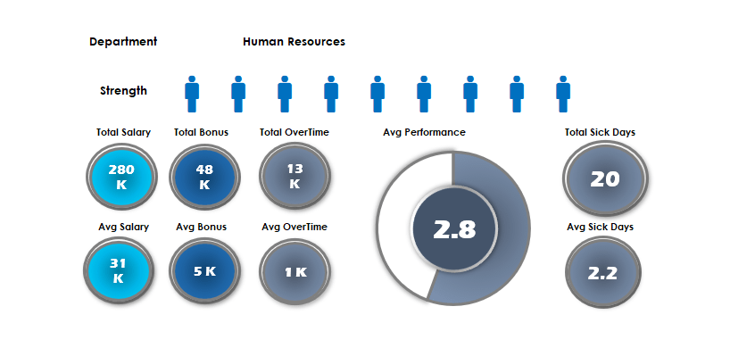
Keep an eye on the HR resources of the company! In today’s excel dashboard guide, you will find two ready to use workbooks. As usual, we will build the dashboards from the ground up.
The first template uses a people graph. You can track the following key metrics: Salary, Bonus, Sick days by branch.
How to show the performance using a new way? The first thing that you should learn an old Excel function. The fact: sparklines will not appear in earlier versions. Making a good dashboard in Excel is a space-saving job. If you are using the REPT function and a little trick, you can fully replace sparklines. Because it is a text function, you can repeat custom fonts in a single cell. Read more, and you will see how it works!
Are you ready to use the linked picture method in Excel? The drop-down list and pivot tables are core functions in Excel. The next dashboard has an easy learning curve. As first, place your data set in the data Worksheet. Insert simple vector graphs into the ‘Data’ Worksheet. Create unique ranges for graphs using the name manager. After that, link the pictures to the ‘Dashboard’ sheet from the ‘Data’ sheet. Finally, use line charts to display the plan and actual values. It is easy!
Financial Dashboard Template
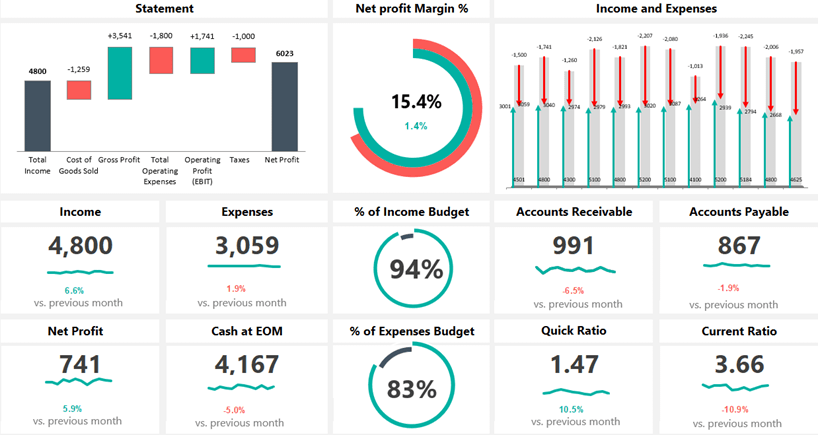
Check our financial dashboard template! One of our favorite spreadsheets will produce a dynamic dashboard! You can track the main financial metrics month by month. Show comparisons and trends using modern chart types, grid layouts, and smart navigation structure.
The included metrics and groups are efficiency, liquidity, and profitability. Our template combines traditional reports of financial information with charts of financial measures. The excel dashboard provides a logical and easily editable structure. You can put your raw data into the ‘Data’ sheet. Apply some calculation on the ‘Calc’ sheet. Finally, show the result on the main dashboard sheet.
If you are looking for a clean dashboard to take a quick overview, you are in the right place at the right time. Using this template, you can easily communicate the result with your staff. You can measure Incomes, Expenses, Net profit, etc. The dynamic waterfall chart helps you to track the yearly performance from the Total income to the Net Profit. We apply infographics-style double doughnut charts to visualize the net profit margin.
Dashboard Best Practices

Dashboards in Excel – The all-time classic! We have a goal, which is the exact value that it should reach and ranges for tracing purposes. The business world for some time now is heading in the direction that we weigh every possible thing. To quote a phrase: we weight it, it gets better. So we got the idea for the key performance indicator from here. And how right is the before quoted sentence!
Do we know the sources of the information? Where is the dashboard “feed” from? Automated updates are necessary, or is it enough to send daily or weekly reports? If we know the answer to all these questions, then it will be easy for us. If we do not, then we have to find out every little detail by a preliminary survey.
How do I choose the appropriate chart? This always depends on the given project. Think about what you want to visualize. In the newer versions of Excel, you can use the Recommended charts function.
Which is the best solution for creating a dashboard? If you only have a few key performance indicators, then a gauge chart is the best. If there are more of them, we recommend the bullet chart.
Is it rewarding to use a business intelligence or kpi dashboard? If the usual excel dashboard is not enough, then yes. The Excel Power BI was built for cases like this!
Dashboard Example

Today you will learn how to create a dashboard using key metrics. If you are an Excel newbie, this tutorial is yours! This Excel dashboard will show you how to enhance your story using key performance indicators. Good to know that you can edit the template freely. A great KPI template is simple: create a proper layout and build a wireframe. Pick your key metrics carefully!
Let us see the main steps! As first, you need to clean, group, and sort the data. When it is done, use the name manager. It can help you to define a range. Are you want to highlight the top 5 and bottom 5 performance? No problem, use simple Excel functions to reach your goal.
Dynamic dashboards in Excel are great! If you are using option buttons, form controls, and small macros, you show a large data set in a small place.
You will learn how the OFFSET function work. It is a volatile function, but this is one of the best ways to create a dynamic list in Microsoft Excel. Read more about this KPI Dashboard Template!
Dashboard Form Controls
In this tutorial, you will learn how to create an Excel Dashboard using form controls. Are you looking for a space-saving solution? We will use a radio button, slider, and some smart technics to build a dynamic dashboard. Furthermore, you will learn how to save time without using pivot tables. If you have a large amount of raw data, the best choice is using built-in Excel tools.
Use these controls on worksheets to help select data. For example, boxes, spinners, and scroll bars are useful for choosing items from a large list. If you want to add a form control, go the ribbon. Now chose the Form Control Menu. Select the right control, which is fit your project. Select the cell or range you want your form control and insert it. You can resize the forms anytime. Easy!
Download the Excel file, which contains the dashboard template. Follow the step by step instructions! We will help you to make the right business decisions.
Customer Service Dashboard
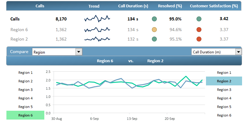
Download our customer service dashboard template and make quick decisions! Use dashboards in Excel to analyze trends and track the performance. We love drill-down methods! With its help, you can transform your data into a custom view. It’s important to display the data in an easily understandable format.
How to create it? The answer is simple. Show the most important metrics! Agents, team leaders, managers depend on a well-organized dashboard to track performance over time.
Our goal is to improve customer service’s performance. Furthermore, we’ll take a snapshot of the plan vs. actual ratio for improvements. In the example, we’ll track and measure the following metrics: Calls, Resolved Calls, Customer Satisfaction.
This excel dashboard allows you to transform data into an advanced template! Get information about various levels, from overall contact center performance to departments and sales representations.
We already know that processing a huge data set is not an easy task. Discover how to convert the results of outgoing calls into an advanced dashboard template!
Dashboard UX Template

The Dashboard UX template will show you how to create better Excel dashboards using smart screen tips. You will learn how to make a clickable question mark icon. After that, it’s easy to show or hide the context help.
Would you like to improve the UX? This feature is yours! The ideal case is if you have easy to read dashboards. In some cases, you have to add some comments because a few metrics requires further explanation.
How to build comments to avoid poor report design? For example, provide information to describe a particular data visualization, or to explain data values shown.
There are methods in Excel to avoid help text cluttering up your dashboard template. The best way if you show pop-up windows (text boxes) upon clicking or hovering over a help (question mark) icon.
It is not rocket science, learn how to add any description for your template without any troubles! Download our free template and check how to provide better support for users using a single page dashboard.
SEO Analytics Dashboard

SEO Analytics Dashboard Template provides an overview of the performance of your site. With its help, you can track 11 SEO metrics, for example, page views, bounce rate, traffic sources. We have sad quite a number of times that raw data without a visual context is useless. In a nutshell, charts that make life easier.
If you are building a dashboard in Excel, we recommend using sparklines. This mini chart is a smart choice to show trends in a cell or a small space. For the greatest impact, place your chart near the data. Use sparklines if you want to highlight the peaks and show trends.
Use a simple setup, the Excel dashboard template shows the trend over 45 days by default. If you need more options, use the built-in drop-down list and select the period what you want to show. Look at the peaks and lows over days or months; you will see the characteristic of your site. In the example, most of this data comes from Excel. If you need more, you can get real-time data from Google Analytics using Power BI.
Call Center Performance Template

Learn how to create a one-page dashboard template for tracking the actual status of key metrics. Use our call center dashboard to track the weekly activity of a call center. In some cases, less is more. Insert a simple line chart and column chart (combo chart) to display the variance for each week.
You will get answers about how to reduce the time to answer and abandon rate and increase the first call resolution (FCR). Before we start, we will explain to you the most used metrics with the help of a few examples. Using these KPIs, you can track and trace the overall service level easily.
Today’s guide about to create and configure a spin button in Excel and create a dynamic report. This free spreadsheet displays information for the relevant audience. Last but not least: Improve decision making and simplify your data set! Our main goal is to track the ‘Time to Answer’ and ‘Abandon Rate’ and show them on a clean dashboard.
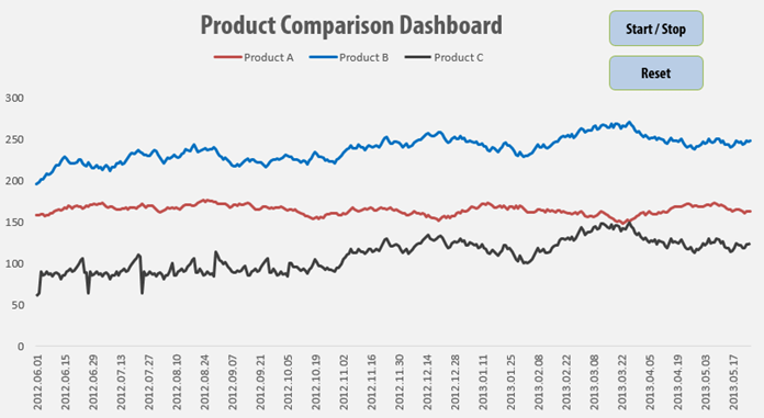
Customer Analytics

Today we will show you how to build customer analytics in a short time. This Excel dashboard contains many useful ideas, we will explain all of them. Follow our tutorial and learn how to build a dynamic dashboard in Excel.
Let us see the main steps! As usual, you will use the ‘data’ sheet to create an Excel table. If your data is in raw format, you should have to convert the range into a table. For the sake of simplicity, we will use five products and five customers to build a dashboard. Use a line chart to highlight the min and max sales value. Apply the red color for the lowest, and green fill for the highest value.
Select cell I7 and go to the Data tab on the ribbon. Insert a drop-down list. Make sure you checked the list option. Now link the data range – which contains months – to the given cell. From now, you can select the month, and your chart will reflect in real-time. Take a closer look at the ‘calc’ sheet! We will explain how to create a dynamic list using formulas. Read more about this free excel dashboard template!
Healthcare KPI Dashboard

If you want to create an Excel dashboard using infographics, take a deep into our template! Today’s lesson will be about a custom business spreadsheet. You will see how to build a stunning report using a male and female infographic. The good news: we know how to build a heat map style dashboard in Excel. No more boring pie charts! If you like custom dashboard design, follow our detailed guide, and download the free template.
You need only a few steps to track the main metrics on your dashboard template. As first, go to the ‘Calc’ sheet and plan your structure. Divide your intervals into 16 equal parts. With the help of the PERCENTILE function, you can split the data range. For example, if you want to can decide to examine peoples who score above the 10th percentile. After that, create a gradient color scale. The template contains built-in color schemes. You only have to pick your preferred colors.
Finally, create 16 shapes and assign the colors to them. We are ready! Stay tuned. We’ll improve your dashboard frequently and provide the latest tips and tricks.
Dynamic VBA Dashboard
In this free example we will use sales data to create a scrolling chart using a simple macro.
We’ll build an interactive report applying Excel’a VBA with exercise file which you can download. We will see the essential things that we need to understand to develop dynamic charts.
Learn advanced tricks to create awesome visualization! We’ll use a small animation because the task is so unique that we don’t get along with the known methods.
Free Dashboard Widgets
What is a widget? We hear and talk a lot about it in our everyday work. Maybe many don’t know what this phrase exactly means.
Widgets are supplements, mini applications that Excel does not include as a default. Do you need new ideas? From gauge chart it is never enough! The quarter style widget is not too frequent but can be excellently use.
Just imagine that you have a template and you notice at the end that you run out of place on the worksheet. We will help you to fix it!
Sales Dashboard

If you are working with an Excel Dashboard and you are in sales, you have to monitor often the sales of your team. It is time to talk about today’s topic. The scrolling list using the OFFSET formula is a handy tool to create dynamic lists. Dashboards in Excel are very popular, and we have made many blog posts about them.
Let us see our data set! The main list contains all states of the US. We only want to show five states in a small window. With the help of a slider (we’ll talk about it later in detail), we’ll create a scrolling-list. Why is this good? Viewers can switch between countries using menus. We can use it in such situations where we only want to show parts of a large data table. Learn more about it. So many reasons why we love Excel dashboard templates!
Product Metrics Dashboard

How to create a dynamic product metrics template? It’s a crucial criteria in designing a report that is should support valuable business decisions.
The interactive window on the right hand site is the most valuable part of the product metrics dashboard. For the chosen product we display the most important indicators on an interactive chart. We visualize the results for the marketing related to 15 different products.
Furthermore, we display trends and graphical elements so the report will be smarter. Sparklines is one of the most popular mini charts. It is great for displaying trends!
We use the gauge chart here for the first time. We’ll learn a lot about that later!
Rolling 6 months Dashboard
Dynamic charts are core elements of dashboards. In this tutorial, you will get great tips to build a timeline based data visualization. We have said many times that the best dashboards in Excel based on form controls. We love this topic because, in most cases, we have to transform large data sets into a small dashboard screen. At first glance, it is not an easy task.
Today’s goal is to create an interactive dashboard to track the key metrics. As first, place the initial data set. Above all, go to the Developer tab. Insert a blank list box. Fill the list box: right click on the control! Add the input range and the cell link. In the example, the input is the range that contains names.
Insert a column chart! Column charts are used to compare values across categories. Add a line chart. Under the trend options, choose the moving average. Finally, use two periods moving average.